Designing with compassion
Rethinking Wellness Apps Beyond Streaks and Checklists
Project Overview
I’ve always been curious about how we design for wellbeing, especially in a world where so many apps treat self-care like a checklist. Most wellness app I tried pushed the same message: track your habits, hit your goals, don’t break the streak.
For some, this works. But for many others, friends around me included, it quickly turns into pressure, guilt, and burnout. I started wondering: What if wellness design didn’t demand perfection or constant progress? What if it could be gentler, something that welcomes you back, even on your off days? This project explores how wellness design can shift from a one-size-fits-all model of achievement to something more compassionate and human-centered, one that embraces life’s ups and downs and meets users where they really are.
Competitive Analysis
As part of the initial research phase, I previously created a video review with my colleague analysing popular wellness apps such as Headspace, Calm, and Stoic. This exploratory research provided valuable experience and broad insights into common design patterns, user flows, and motivation strategies typical in the wellness app space.
However, to ensure the relevance and currency of my findings, I recently revisited Headspace for a more targeted analysis. This focused analysis revealed specific challenges regarding the limitations of goal- and streak-based motivation and its emotional impact:
- Streaks and Progress Tracking Pressure: Headspace prominently features streak counters, which aim to drive user engagement through measurable achievements. However, some users who lost their long-running streak showed disappointment and frustrations. However, something to takeaway is that they offer the ability to hide the streak function, which could offer flexibility and cater to different user needs.
Overwhelming, Generic Interface: Some users report difficulty finding content relevant to them amidst clutter and generic “Today” recommendations, which shows that simplicity layout/ navigation and personalised content is important to users.
These insights shaped my understanding of the common challenges in wellness app design and informed my choice to look into the Fabulous app for a deeper exploration of how to create a more compassionate and adaptable user experience.
Products Exploration & User Insights
After some exploration, I chose to look into the Fabulous app because it takes a refreshing, story-driven approach that feels more personal and emotionally engaging than most wellness tools. It invites users into guided journeys, uses motivational language, and frames habits as part of a larger narrative, not just tasks to check off. But even with this thoughtful foundation, Fabulous still leaves gaps.
To understand how users experience the Fabulous app in real-world settings, I analysed a random sample of 30 user reviews sourced from both the Google Play Store and Apple App Store. I found out what they liked, what frustrated them, and what they wished the app could do better. Each review was categorised by theme, whether it was positive or negative, and any suggestions users shared. This gave me both quantitative and qualitative insights.
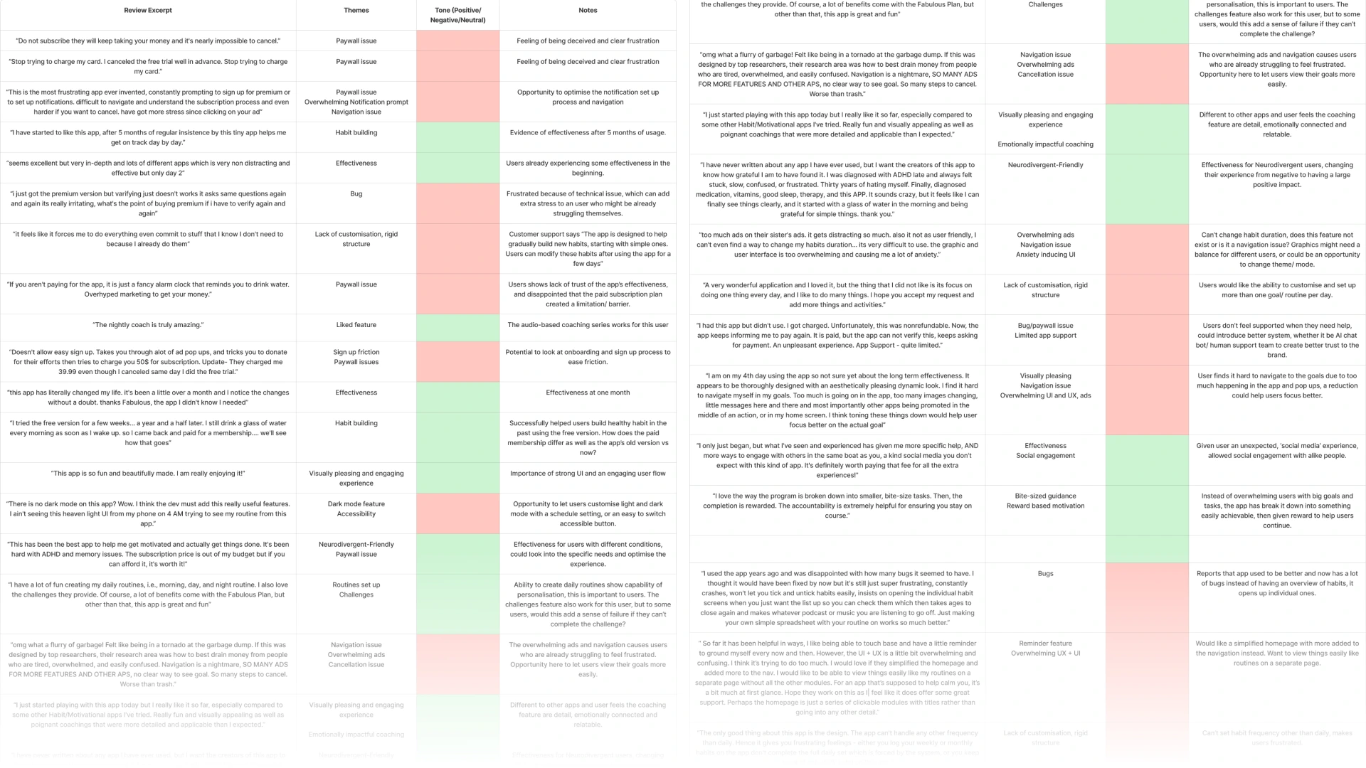
What users like (Approx 53% mentions):
Calm, Beautiful Design: Users found the app visually pleasing and emotionally uplifting.
Helpful Structure: The habit system and daily routines helped many users stay consistent.
Supportive Tone: The nightly coach and voice-guided prompts felt kind, grounding, and non-judgmental.
Neurodivergent-Friendly: ADHD users especially appreciated the clear structure and manageable tasks.
Key painpoints (Approx 63% mentions):
Too Rigid: Many wanted more control to skip, swap, or set habit frequency.
Frustrating Paywall: Users felt misled by unclear pricing or unexpected paywalls.
Too Many Notifications: Constant reminders sometimes felt stressful instead of helpful.
Bugs: Technical issues made it hard to use or interrupted the experience.
Confusing Layout: Some users felt lost navigating the app or couldn’t find key features.
Opportunities/ feature request:
Mood-Based Support: Users want check-ins or adjustments based on how they feel.
More Personalisation: Let users build routines their own way, with flexible goals.
Simpler Design: A less cluttered interface to reduce overwhelm.
Kinder Reminders: Notifications that are softer and more user-controlled.
Why I Decided to Explore Another App?
I discovered that many pain points stemmed from frustration with the subscription model and unclear cancellation flow, with users describing it as “scammy.” This eroded trust and likely contributed to churn and negative word of mouth. It reinforced for me how essential transparent, user-friendly flows are to both customer loyalty and brand reputation.
Overall, the patterns made it difficult to focus purely on product design and user experience, as the trust barrier heavily influenced user sentiment. In order to conduct a fairer, feature-focused analysis and stay aligned with my design goal, to explore how wellness apps can support users with kindness rather than pressure, I decided to shift my focus to another app.
This allowed me to carry forward the insights I had gathered while continuing the case study in a direction that better reflects the kind of ethical, human-centered design I aim to practice.
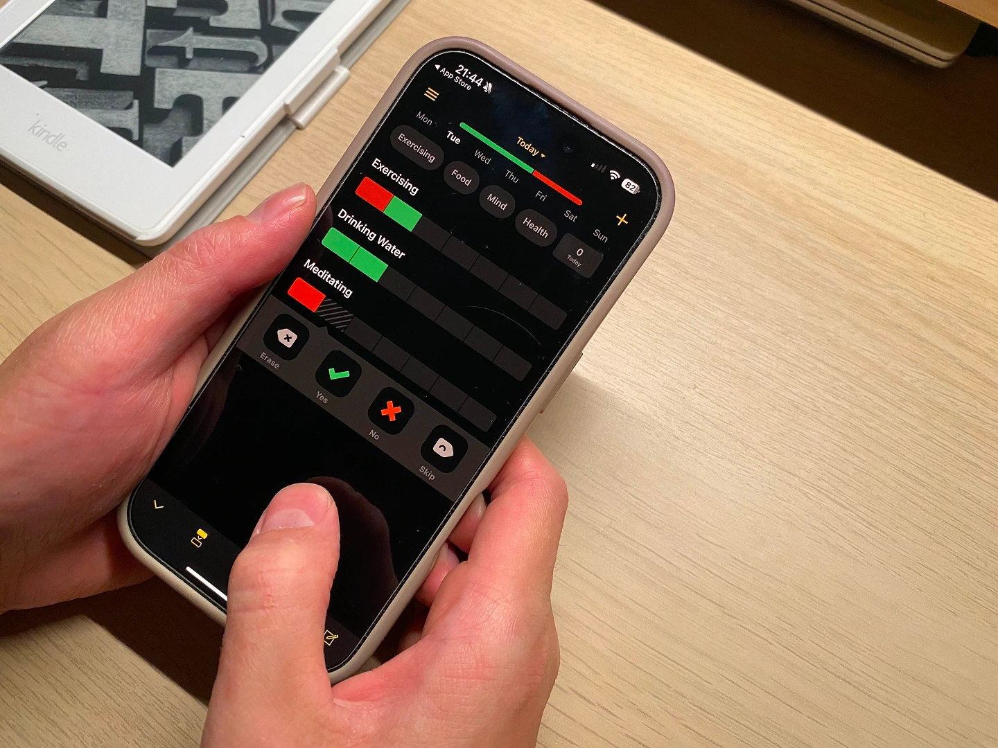
Way of Life: Habit Tracker App
It is a simple, habit-tracking app that encourages users to reflect on their daily behaviours without relying on streaks or gamification. The app uses a visual colour-coded system (green, red, skip) to help users see patterns in their routines, while offering space for notes and journaling. Unlike many wellness apps, Way of Life feels less about perfection and more about building self-awareness over time.
This makes Way of Life a compelling example of a wellness tool that prioritises self-awareness over perfection. It feels gentler and more flexible than traditional habit apps, which makes it a closer fit for the core question I’m exploring.
That said, I wanted to dive deeper into its user experience to see where it succeeds, where it falls short, and what design opportunities might still exist to support sustainable, self-compassionate habit change.
What users like
Clean, simple and Intuitive UI: The “green for yes, red for no” system is particularly popular for its straightforwardness.
Effective Habit Tracking: Many users reporting positive impacts on their lives.
Data Visualisation: The ability to display data in a meaningful way through charts and graphs, which helps in identifying trends and staying motivated.
What users don't like:
Missing “Streaks” Feature: The absence of a “streaks” feature, which tracks consecutive days of a completed habit, is a significant drawback for many users who find it a key motivational tool.
Usability Issues: Some users have reported frustration with the user interface, particularly when trying to mark entries for previous days without accidentally marking the current day.
Limited Tracking Options: Some users wish for more advanced tracking options, such as the ability to count a task multiple times a day or to rate feelings and moods.
Scheduling weekly goals: Unable to set weekly. monthly, or yearly goals, have to track daily.
No calendar view: Including this would make the experience more intuitive.
Interview and Usability Testing
For this case study, I conducted a mix of real and hypothetical user interviews based on assumed personas, informed by common user behaviours and pain points I’ve observed through past UX work and app reviews. The goal was to identify emotional insights, motivational patterns, and friction points to guide product strategy and user-centred design choices.
Key areas to explore:
What are users’ motivations and challenges around building wellness habits? How is their experience with streak-based habit tracking apps? What are users’ experience of the key journey with the Way of life app?
Key findings:
The key motivation factor for users to start building wellness habits or using wellness apps are usually after emotional lows.
The main challenge for users is consistency, due to low initial motivation or not seeing progress.
Streak-based systems can sometimes shift focus from self-growth and improvement to performance and perfectionism.
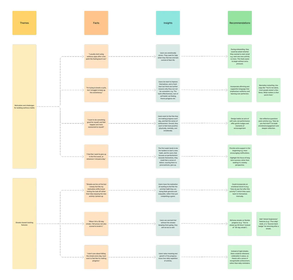
The experience with Way of life app:
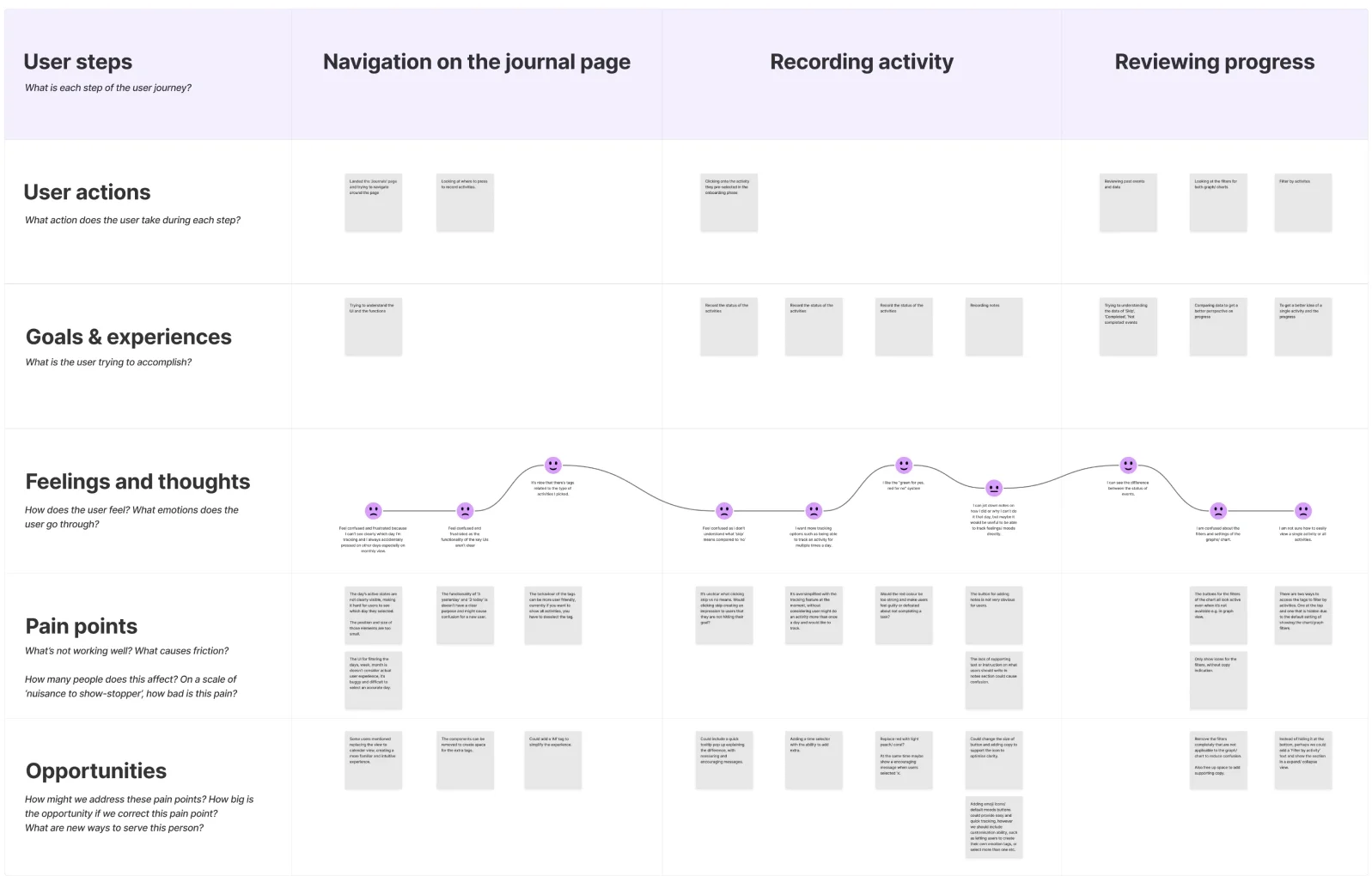
(Focus on the key activities - activity tracking, navigation on journal page and reviewing progress)
The UIs and component behaviours/ interaction can be confusing, not an intuitive experience.
The tracking feature is oversimplified, ignoring different use cases.
Users want more than just checking boxes, they crave for deeper emotional engagement, such as emotional check-ins features.
Journey Mapping
Using the insights from app store and interview, I created a user journey map that illustrates the typical flow for a first-time user, focusing on the key engagement journey. This visualisation highlights key touch points, emotional highs and lows, and potential friction areas.
Mapping this journey allowed me to identify usability gaps, assess feature alignment with user intent, and pin point opportunities for improving engagement.
How might we…create a more emotionally supportive and flexible experience that helps users build healthy habits without the pressure of being perfect?
Feature Prioritisation
To improve the Way of Life app’s emotional resonance, usability, and flexibility, I prioritised features that directly address user pain points around clarity, motivation, and self-compassion. These improvements are not only valuable for users—they also support long-term engagement, reduce drop-off, and increase product stickiness, aligning with common business goals in the wellness app space.
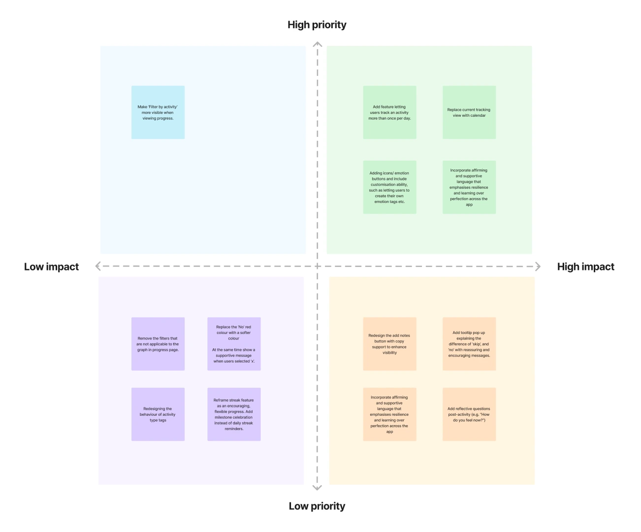
Overall Recommendations
Emotional Check-in
Reflective questions prompts with customisable emotion buttons for deeper self-awareness.
Optional, Flexible Streaks
Reframed as milestone celebrations, instead of daily pressures for a more compassionate form of motivation.
Calendar-Based Tracking
A visual, intuitive view of habit progress over time.
Multiple Daily Logs
Allowing users to track habits more than once a day to match real-life routines.
Supportive Microcopy
Include encouraging language and clarity across the app to build resilience and emphasise overtime progress over perfection.
Reflection & Learnings
Though this was a speculative project, it was grounded in real user input, from app store reviews to informal interviews. It helped me strengthen the connection between emotional drivers and design strategy.
What I learned through the process:
Research isn’t always linear. I initially explored a different wellness app, but early analysis showed it didn’t align with the core questions I was investigating. Shifting focus led to deeper insights and reminded me that strategic design often means knowing when to pivot.
Compassion and business goals aren’t opposites. Designing for wellbeing can drive long-term engagement, loyalty, and retention, if we do it with care.
Process is the product. This case study was less about the final UI and more about showing how strategic research and emotional insight can inform better product decisions.
If this were a live project, I’d expand by:
Conducting stakeholder interviews
Looking at product analytics and business metrics
Running iterative testing to measure emotional impact over time
Final Takeaway
This project strengthened my ability to apply UX research and strategy to complex, human-centred challenges. It reminded me that effective design isn’t just about the usability, it’s about how users feel while using the product. Especially in wellness, where every person’s needs and rhythms are different, we need to build products that are flexible, empathetic, and human. People don’t just want to hit goals, they want experiences that adapt to their energy, their pace, their real life.