EV Companion app
Timeline: 4 Design Sprints | 20 Days
Team: 2 UX/UI Designers
As the EV market grows, the demand for EV charge points also rises. For this project, me and my colleague have created an all in one app to meet EV users’ needs. Prior to this project, I didn’t have much knowledge of EV apps, but we carried out some in-depth research and UX analysis to boost our understanding and find out what users require.


What we aim to find out:
Project overview
Initial research & competitor analysis
We looked at some of the existing issues and challenges EV drivers face as well as comparing between the apps that’s currently on the market such as their pitfalls, the positives and how users would like the apps to improve. We also downloaded the apps ourselves and walkthrough them to get a real feel of its UX and UI designs.


Current pain points
To summarise the findings, key features were picked out from the apps which helped to work out the sitemap and designs at a later phase.


Key features
| RESEARCH


Ethnographic research
| EMPATHISE
Using all the research we have done, we began to paint the picture of the user types and demographics through user personas. We focused on gaining a deeper understanding of the users such as their needs, goals, motivations, pain points.


User personas
Using secondary research to study driver’s behaviours and habits so we get some insights of the current market demands.
User journey map


This allows us to go in-depth about each step the user might take to complete a task, and we can identify key touchpoints and review what features need to be included etc.


User empathy map
To understand users further from their emotional perspective, we focused on a few key areas such as what they see, what they hear, what they say and do, what they think and feel.


Sitemap & userflow
| DEFINE
We started defining the sitemap to give ourselves a clear visual overview of the app and this also helps prioritise the workload among the team.
Afterward, we moved onto creating a user flow that gives us a chance to test our initial thinking and make further iterations.


Lo-fi & hi-fi wireframes
| IDEATE & TEST
After we mapped out the structures of the app, we begun with some lo-fi wireframes to quickly test the ideas and save time to tidy up the designs at the next stage. With the hi-fi wireframes, this is when we had to clean things up and carefully consider each component types and size, as well as the overall element hierarchy etc.


Prototype


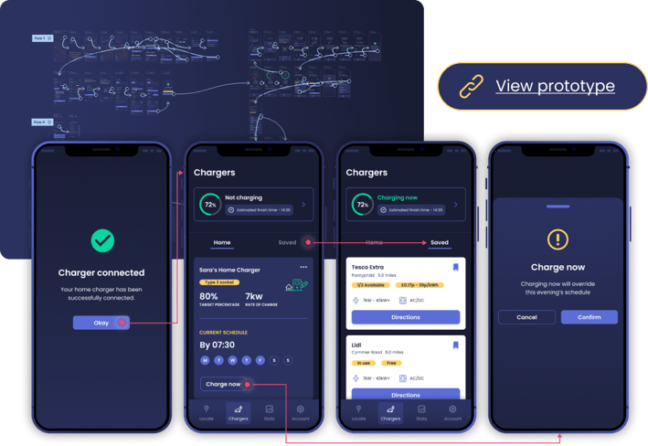
Before stylising everything, it was crucial to link up all the screens and make sure they are functional and the interaction is smooth.
Colour palette & typeface
| DESIGN PRINCIPLES
To tie in with the modern vision of EV charging, we selected a bold and contemporary colour palette. Aside from just making the designs look good, it was crucial to consider whether our elements meet accessibility standards such as colour contrast and font size.


Grid system
Using a grid system ensures that designs remain consistent across all screens in the app, and having a clear visual hierarchy makes it easy for users to scan and reduces cognitive load.


Working on this project has expanded my understanding of EV charging, what users want and how the current apps in the market function. By following the design process, it gave me a clear structure on how to work through each tasks. It challenged my problem-solving and critical thinking skills which enables me to apply the same thought process and what I've learnt to future projects.


